Visual Identity Essentials

This section highlights the key visual elements that define The Collective Thrive’s brand. Explore foundational logo concepts, color palettes, and typography choices that establish a consistent and meaningful presence.

Logo Concepts Reflecting Our Mission

Explore curated color schemes that embody The Collective Thrive’s commitment to growth, collaboration, and sustainability.

Colors that connect

Brand Color Palettes

Earth Tones

Vibrant Hues

Neutral Balance

Typography that Speaks Your Brand

Font Styles to Define The Collective Thrive

The Collective Thrive uses a combination of modern sans-serif fonts to communicate clarity and approachability. These fonts support clean readability across digital and print materials, reinforcing a professional yet inviting tone.
Primary fonts feature balanced proportions and open letterforms, reflecting transparency and collaboration. Secondary fonts complement with subtle personality, adding warmth without compromising legibility.
Font weights vary from light to bold, allowing flexible emphasis for headlines, body text, and calls to action. This hierarchy guides the reader naturally through content while maintaining a cohesive visual flow.
Consistent use of these typefaces across all brand touchpoints ensures The Collective Thrive’s message is delivered with confidence and authenticity, strengthening recognition and trust.
Cultivating growth through collective purpose

Visual Mood Board: Defining The Collective Thrive’s Aesthetic

Next Steps to Launch Your Brand Identity

Finalizing the Elements That Define The Collective Thrive

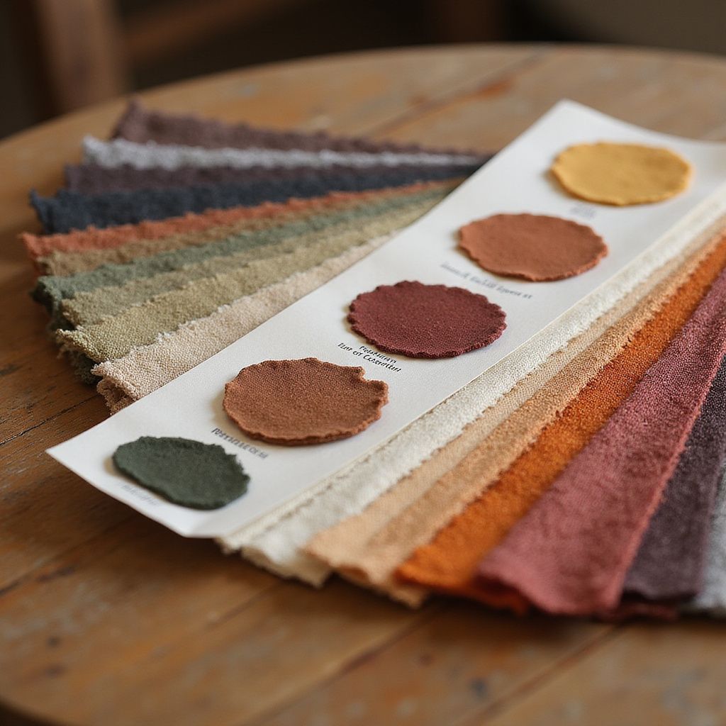
We will consolidate your logo, color palette, and typography choices into a cohesive brand kit. This includes preparing launch materials and setting up your no-code infrastructure to support your community and operations. Our focus is on aligning every detail with your mission and vision to ensure a strong, consistent presence from day one.

Contact Us